
For those of you who are coming across this post & don't know why all this hub bub about the front page, I'll explain. On Etsy they have a group of sellers featured and it cycles evey hour. It is pretty special to be on the front page, because not only do you get a ton of exposure to your shop, but you also know your doing something right. Especially as a book binder, you need to make a book LOOK fun & pretty & accessible. It's not as easy to do that with a book as say maybe, a pair of earrings or a great top. You have to make people say, "ooo... i want!"
To be on the front page it's all about the photo. The better your photo is, the more likely your shop will be seen and make it to the elusive front page. In the last week I've made it to the front page 3 times! At first I sat here scratching my head. Why all of a sudden am I getting noticed? Then it hit me... I am cool! No, seriously! I have taken photos, and retaken photos, and taken them again... each time getting a bit better. I also had a great Etsy friend explain my husband's Rebel Xsi to me, thank you Jen (aka JennaDesigns). I know it's a pain. As they say, practice makes perfect. I think I still have a ways to go. I know my shots can be better, and they will be better. But I need to practice. I thought I would throw up past backgrounds for you all to see. Sometimes it's all we need, is a little inspiration... or an absolute accident!


To be on the front page it's all about the photo. The better your photo is, the more likely your shop will be seen and make it to the elusive front page. In the last week I've made it to the front page 3 times! At first I sat here scratching my head. Why all of a sudden am I getting noticed? Then it hit me... I am cool! No, seriously! I have taken photos, and retaken photos, and taken them again... each time getting a bit better. I also had a great Etsy friend explain my husband's Rebel Xsi to me, thank you Jen (aka JennaDesigns). I know it's a pain. As they say, practice makes perfect. I think I still have a ways to go. I know my shots can be better, and they will be better. But I need to practice. I thought I would throw up past backgrounds for you all to see. Sometimes it's all we need, is a little inspiration... or an absolute accident!


The first photos of my journals my wonderful husband took, on the back of a quilt I made. These photos were nice, but the lighting in our old apartment was not the best. With experience I know now that I just should have moved around to get the right window at the right time of day.


Then we built a light box. It was great to be able to take pictures at midnight when we had time and could control everything... but do you notice that it looks like I forgot to put pages in the journal... white is just too harsh for my journals, soo....


I used a tan peice of kraft paper. This was better, but still boring. And tan matches some of the journals and not others, as you can see. This is a beatiful journal... but the background does nothing to make it look extra special.

Then a custom order came from my graphic designer, Melissa at TheSpeckeledPear, and that was it, I took shots on this table & hooray! This is a table I used in my gallery (yes, I owned a gallery). I bought it from a friend of mine's father that made it out of old barn boards. It has so much personality & character. I have taken all my pics on it since. It gives the journals a romantic feel.


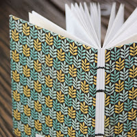
And these are the shots that made the front page. Better, right? I hope you all go out and work on your photos, I know there are a few of mine that need tweaking :D Don't be afraid to try something new!!!

Congratulations! Your photos are indeed lovely. :) Theresa
ReplyDeleteAwesome!!! I built my own light box for my photos and they look so much better. Congrats on making the front page (3 x!!!) Maybe I'll make it one day -- keep up the great work!
ReplyDeletehttp://enoreelapo.etsy.com/
That's right...you are cool!! Congrats!! Your journals are beautiful!! :)
ReplyDeleteThis a great post! I love to see how your pictures have evolved! The barnwood is amazing! Congrats on your FP success!
ReplyDelete